
Table of Contents
Skincare product photography lives in a funny little tension: you’re selling something tactile through a flat rectangle. The viewer can’t feel the glass weight of the bottle, the satin finish of the label, or the “click” of a well-designed cap. So the photo has to do that work. A premium-looking image communicates texture, care, and confidence. A mediocre image communicates “maybe this was made in a hurry,” even if the product is excellent.
The good news is you don’t need a studio, a $3,000 camera, or a wall of lighting gear to make skincare products look expensive. You need good light, controlled reflections, clean styling, and a repeatable workflow. Phones are already capable of crisp, beautiful images, especially when you design the scene intentionally.
This guide walks you through a practical, phone-friendly approach to photographing skincare products so they look premium, with tips for lighting, backgrounds, composition, editing, and a few easy “luxury cues” that instantly elevate your shots.
What Makes a Skincare Photo Feel “Premium”?
Before you touch a camera, it helps to know what you’re aiming for. Premium product photos tend to share a few traits:
- Clean, uncluttered compositions
- Soft, directional light with gentle shadow falloff
- Controlled highlights (especially on shiny packaging)
- Accurate color and crisp focus where it matters (logo and label)
- Thoughtful props that suggest a lifestyle, not a craft project
- Consistency across a set: same light, same palette, same mood
The opposite of premium is usually not “bad camera.” It’s chaotic light, messy reflections, distracting props, crooked labels, and a background that looks like it’s mid-argument with the product.
Step 1: Pick a Visual “Lane” for the Brand
Skincare photography tends to live in a few recognizable styles. Choose one and commit, at least for a batch of photos, so your images look cohesive.
Common premium lanes:
- Minimal clean: white, beige, pale stone, soft shadows, lots of negative space
- Clinical modern: cool tones, glass, chrome accents, structured composition
- Natural spa: wood, linen, botanicals, warm light, gentle texture
- Editorial luxury: darker backgrounds, dramatic light, high contrast, moody shadows
- Bright playful: bold color blocks, glossy surfaces, crisp light, graphic styling
Pick a lane based on the product’s identity. A minimalist glass serum can look amazing in clinical modern. A botanical balm might shine in natural spa. The key is to avoid mixing signals. A neon prop next to a “calm and gentle” product can feel like two different brands sharing a frame.
Step 2: Use the Best Light You Can Get for Free
Light is the entire game. If you nail the light, your phone can capture premium results. If you don’t, no amount of editing will fully rescue the image.
The easiest setup: window light
- Place your setup near a window with indirect light.
- Avoid harsh sunbeams hitting the product directly, they create blown highlights and hard shadows.
- A north-facing window (or any window with consistent, indirect light) is ideal.
If the light is too harsh:
- Diffuse it with a sheer curtain, a white bedsheet, or a translucent shower curtain taped over the window.
- Diffusion is the secret sauce of premium skincare imagery. It makes reflections smoother and shadows softer.
If the light is too flat:
- Move the setup closer to the window.
- Angle the product so light rakes across the label, creating gentle dimension.
- Add a “negative fill” by placing a dark object (like a piece of black foam board or a dark shirt) on the opposite side to deepen shadows and create contrast.
Step 3: Build a Simple, Repeatable Background
Premium backgrounds are usually boring in the best way. They let the product be the hero.
Great low-budget background options:
- Matte poster board (white, off-white, sand, charcoal)
- Foam board (cheap and sturdy)
- Large ceramic tile (stone-like texture looks expensive)
- A clean baking sheet for a reflective “wet” look
- A piece of acrylic (clear or frosted) for modern, glossy scenes
- Fabric like linen or cotton, ironed or steamed
Avoid these common premium-killers:
- Wrinkled cloth (unless it’s intentionally styled, which is harder than it looks)
- Busy patterns that compete with the label
- Cheap-looking faux marble prints with repeating texture
- Anything with crumbs, dust, fingerprints, or random hairs (the camera will find them like a bloodhound)
Quick tip: if you shoot often, make a “photo board” by taping two boards together in an L shape, one for the surface and one for the backdrop. Instant seamless background, no horizon line.
Step 4: Control Reflections Like a Pro (Even If You’re Not One)
Skincare packaging is often glossy: glass, metallic foils, shiny plastics. Reflections are what make it look premium or cheap.
To improve reflections:
- Diffuse your light (sheer curtain, tissue paper, or a diffuser panel)
- Use white cards to create clean “highlight shapes” on the packaging
- Use black cards to add definition and contrast on shiny edges
- Rotate the product slightly until the label is readable and glare is minimized
If you’re dealing with a shiny bottle:
- Move your phone slightly left or right until glare slides off the label.
- Slight angles are your friend. Straight-on shots can reflect everything behind you, including your phone, your face, and your entire life story.
Wipe the product down
This sounds obvious, but it’s the difference between “luxury” and “found in the bottom of a tote bag.” Use a microfiber cloth. Remove fingerprints, dust, and smudges. For glass bottles, this step is non-negotiable.
Step 5: Style Like an Editor, Not a Collector
Premium styling is intentional. The prop count is usually low. The colors are controlled. The textures make sense.
A simple formula:
- One hero product
- One supporting texture (stone, linen, acrylic, wood)
- One “ingredient cue” prop (botanical, dropper, water bead, cream smear) if relevant
Props that often read premium:
- Clear glass dish
- Neutral ceramic tray
- Minimal chrome tools (like a small spatula)
- Fresh botanicals (one stem or a few leaves, not a whole garden)
- Water droplets on a reflective surface (when done cleanly)
- Subtle shadows from blinds or leaves for an editorial feel
Props that often read cheap:
- Too many unrelated items
- Plastic flowers
- Glitter (unless your brand is intentionally playful)
- Busy bath bombs and random candles when the product isn’t spa-themed
- Anything that looks like it came from a dollar store “decor” aisle
Less is not “boring.” Less is “confident.”
Step 6: Get the Composition Right on Your Phone
Your phone already has the tools you need. Use them deliberately.
Turn on the grid
Most phone cameras have a grid option. Use it to keep lines straight and compositions balanced.
Choose your angle based on the product:
- Straight-on: great for labels, pumps, and tall bottles; feels clean and commercial
- 45-degree angle: adds depth and is often flattering for jars and sets
- Top-down (flat lay): great for collections and ingredient layouts, but requires careful styling and even light
Use negative space
Premium photos breathe. Leave room around the product, especially if the image will be used for ads or banners where text overlays might be added later.
Focus on the label
Tap to focus where you want the crispest detail, usually the brand name and product name. If your phone allows it, lower exposure slightly so highlights don’t blow out.
Don’t zoom digitally
Digital zoom reduces quality. Instead, move your phone closer or crop later.
Step 7: Create “Luxury Cues” With Simple Tricks
These are small touches that make a photo feel expensive.
Add a subtle shadow gradient
Place the product closer to the backdrop for a soft shadow behind it, or farther away for a more dramatic shadow. Control the feel by changing distance to the light and background.
Use a “hero highlight”
A clean, soft highlight on a bottle edge or cap suggests glossy, premium materials. This is where white cards and diffused light shine.
Show texture realistically
If your product is creamy, include a clean smear with a small spatula. If it’s a serum, a droplet near the dropper can work. Keep it minimal and neat.
Use water carefully
A wet look can feel high-end, but only if it’s clean. Use a spray bottle for fine droplets, and wipe the product label area so it stays readable.
Step 8: Shoot a Set, Not Just One Photo
Premium brands rarely rely on one image. They create a family of images that cover different uses.
A simple shot list:
- Hero shot on clean background (e-commerce main image style)
- Angle variation (adds depth)
- Close-up of label or texture
- Lifestyle scene (in bathroom, on tray, near sink)
- Ingredient cue shot (botanical or texture detail)
- Group shot (if you have multiple products)
Shooting as a set ensures consistency in light and color and saves time. It also gives you options for different platforms.
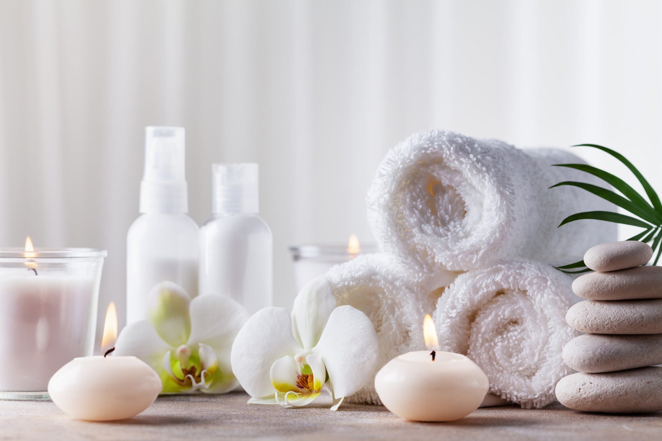
And if you need variety quickly for content calendars, combining your own hero shots with high-quality stock photos of complementary scenes (like spa towels, neutral bathroom counters, or botanical close-ups) can be a smart, budget-friendly way to keep your visuals looking polished and consistent without reinventing every background from scratch.
Step 9: Edit for Realism, Not Plastic Perfection
Editing is where you polish the premium look. The goal is “clean and accurate,” not “airbrushed into another dimension.”
Basic edit steps (phone-friendly):
- Straighten and crop first
- Adjust exposure slightly down if highlights are blown
- Lift shadows gently if details are lost
- Increase contrast a touch for crispness
- Adjust white balance so whites look neutral (not yellow or blue)
- Add mild sharpening if needed, but avoid halos
- Reduce saturation slightly if colors look unnatural
Watch for these mistakes:
- Over-smoothing, which makes the product look fake
- Oversharpening, which makes labels look crunchy
- Pushing exposure too high, which washes out details
- Over-warming, which turns whites into beige
If your background is supposed to be white, aim for clean white without losing product edges. A background that’s too bright can make the product look cut-out and flat.
Step 10: Keep It Consistent Across Platforms
A premium look is partly about repetition. Consistency signals professionalism.
Create a simple style guide for yourself:
- Background colors you use often
- Lighting direction (left or right)
- Shadow style (soft or dramatic)
- Prop palette (stone, linen, glass, etc.)
- Editing style (warm neutral, cool clinical, etc.)
When your Instagram grid, website images, and ads all feel like they belong to the same brand universe, your product automatically feels more premium.
A Simple Phone Setup You Can Build in 15 Minutes
If you want a quick blueprint:
- Window with indirect light
- Sheer curtain as diffuser
- Two foam boards taped into an L
- One white card and one black card for reflection control
- A microfiber cloth for cleaning the product
- Your phone with grid enabled and exposure adjusted slightly down
That’s it. That’s the whole studio.
The Bottom Line
Premium skincare photography is less about expensive gear and more about disciplined choices: soft light, clean backgrounds, controlled reflections, and restrained styling. Your phone can absolutely deliver premium-looking product images if you treat the scene like a miniature set and the light like your most important ingredient.
Start with one lighting setup you can repeat. Shoot a set of images in one session. Edit gently for accuracy and polish. Over time, you’ll develop a consistent look that makes your products feel intentional, trustworthy, and high-end, no matter what camera is in your hand.